
How to customize a button style
In this tutorial, we will guide you through the process of customizing a button style.
Step 1 - Open Website Styles
Section titled “Step 1 - Open Website Styles”Click on the “Website Styles” button.

Step 2 - Open Buttons
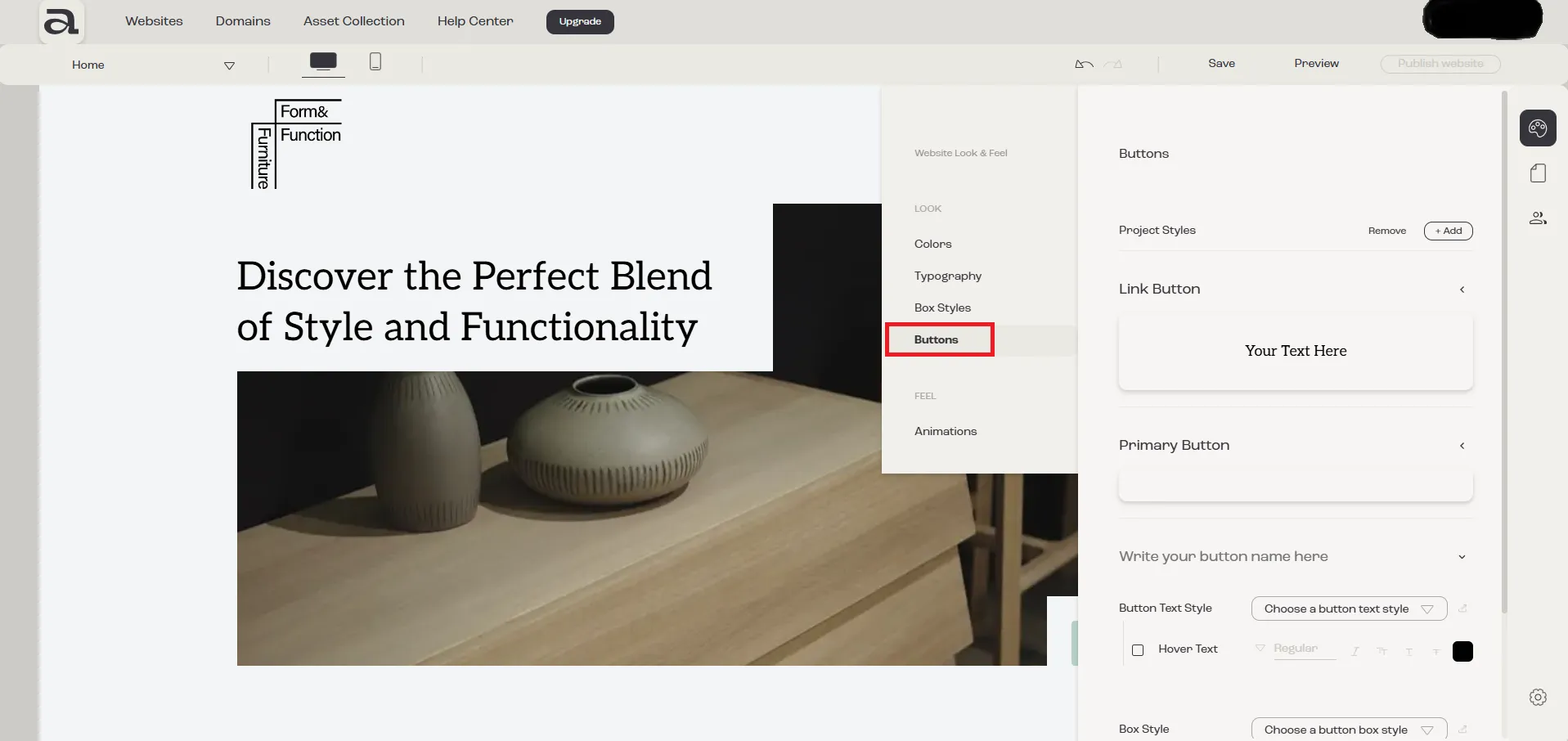
Section titled “Step 2 - Open Buttons”In the “Website Look & Feel” menu, select “Buttons”.
Step 3 - Customize
Section titled “Step 3 - Customize”3.1 - Naming the Style
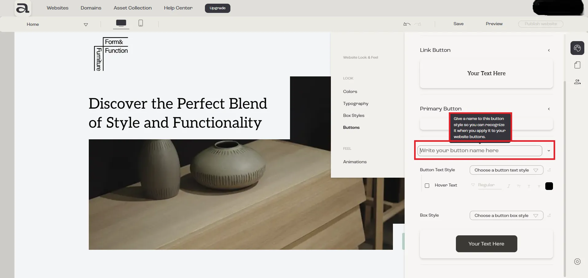
Section titled “3.1 - Naming the Style”First, you need to give your button style a name so you can easily recognize it when using it in your project. Click on the “Write your style name here” input field to name it.
3.2 - Button Text Style
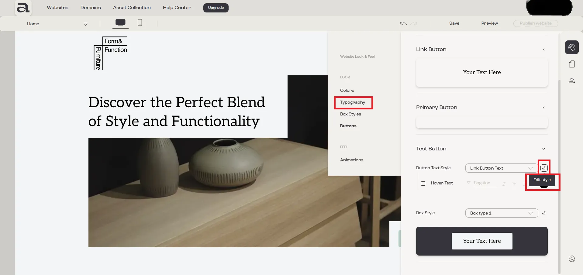
Section titled “3.2 - Button Text Style”To change the button’s text style choose a predefined text style by clicking on the “Button Text Style” dropdown.

To easily identify and edit the text style being used, click on “Edit Style.” This will redirect you to the Typography section.
3.3 - Button Box Style
Section titled “3.3 - Button Box Style”To change the button’s box style choose a predefined box style by clicking on the “Box Style” dropdown.
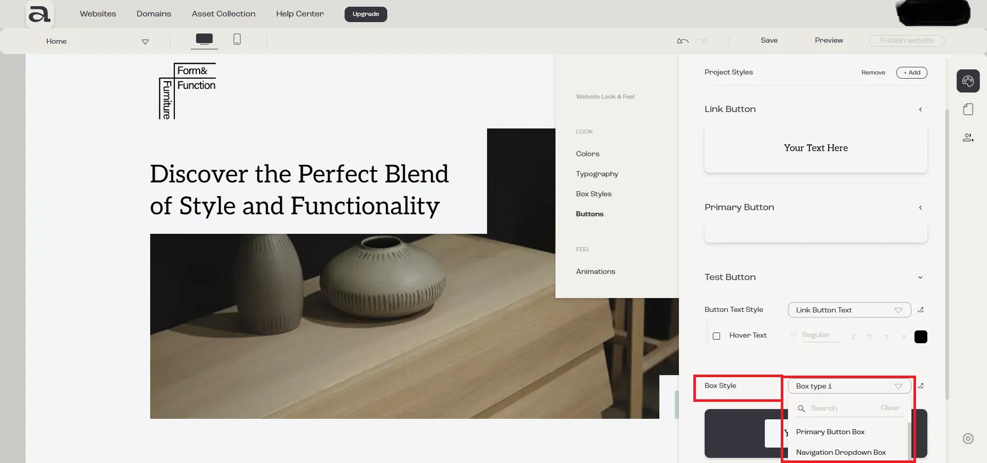
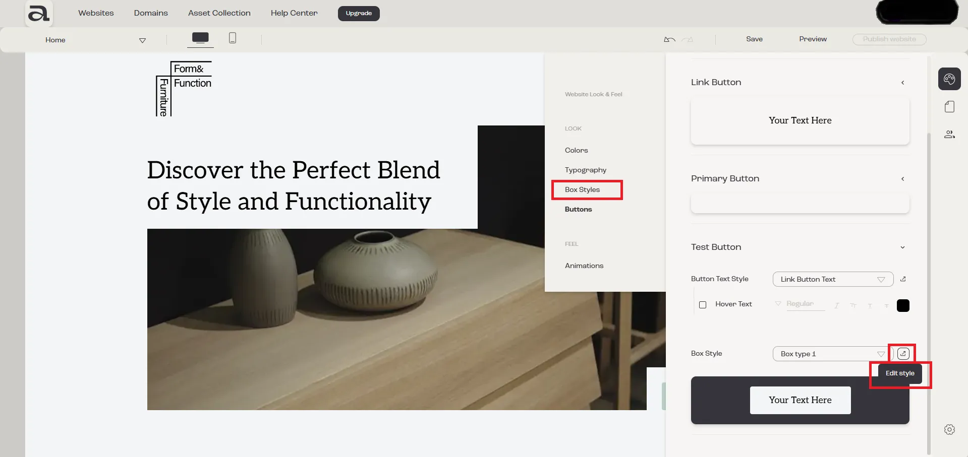
To easily identify and edit the box style being used, click on “Edit Style.” This will redirect you to the Box Styles section.
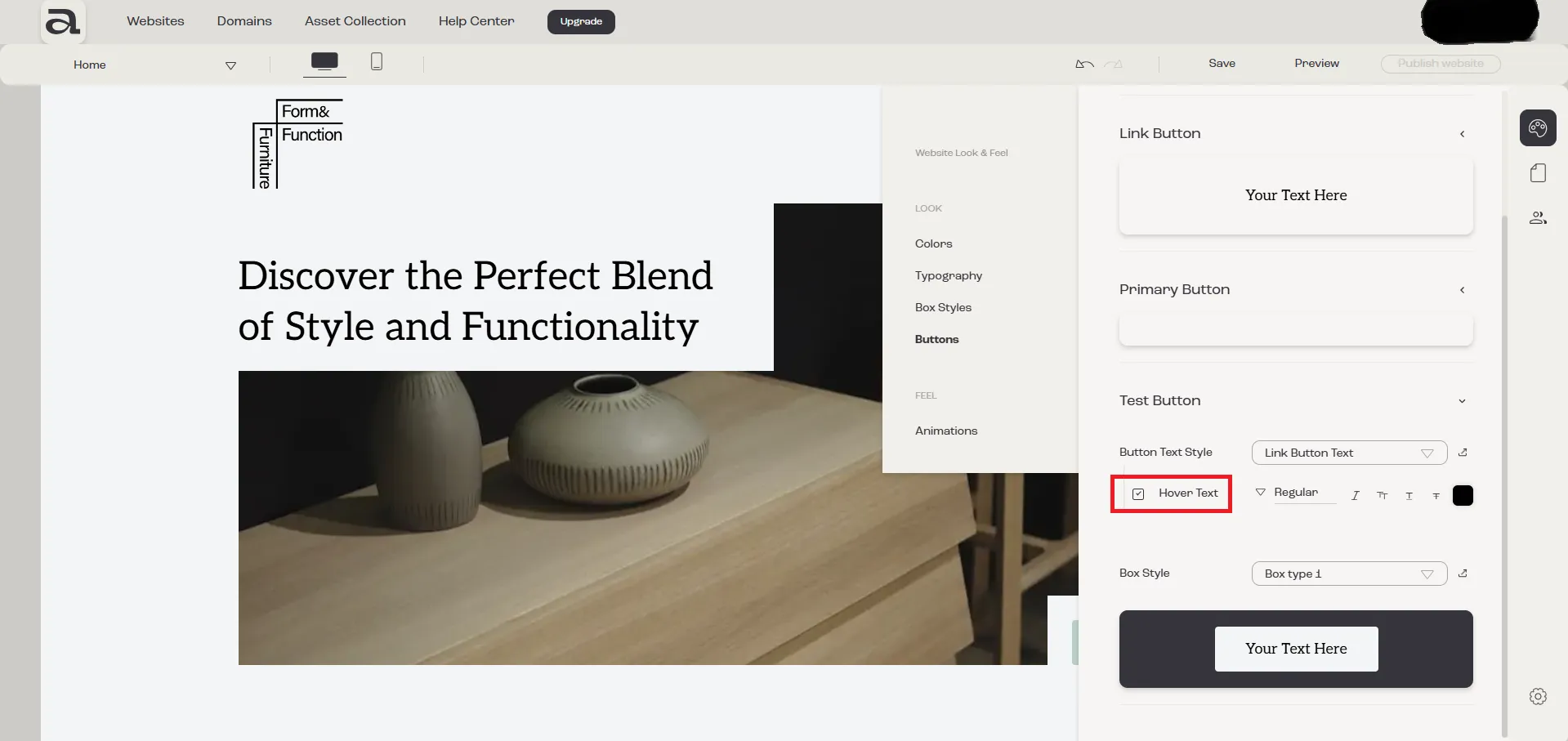
3.4 - Hover Text
Section titled “3.4 - Hover Text”If you want the button text to also have hover effects, enable the “Hover Text” option.
Once enabled, you will have access to several styling options for customizing the text style on hover.
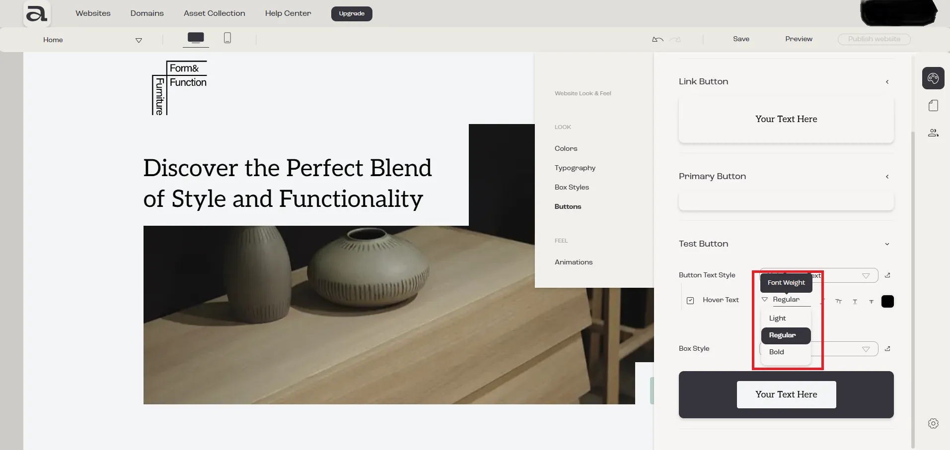
3.4.1 - Hover Text “Font Weight” (bold, thin etc)
Section titled “3.4.1 - Hover Text “Font Weight” (bold, thin etc)”To set the font weight of the hover text, click on the “Font Weight” dropdown menu and select your desired option.
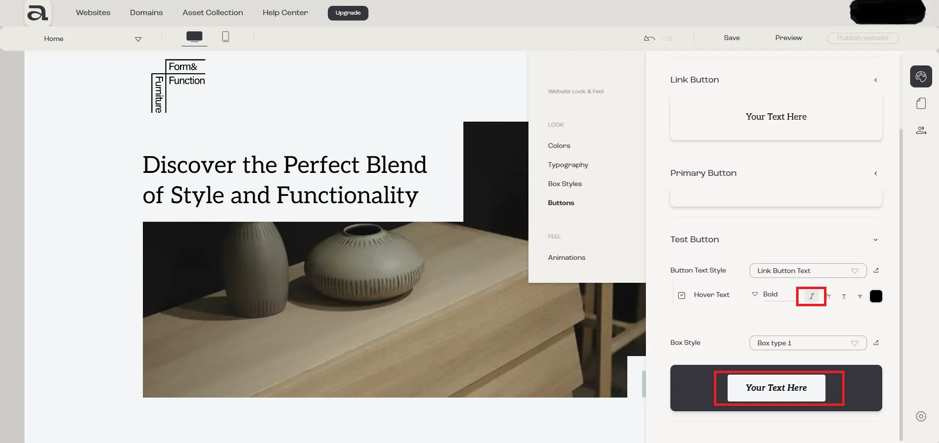
3.4.2 - Hover Text “Italic”
Section titled “3.4.2 - Hover Text “Italic””To apply an italic style to the hover text, click the “Italic” button.
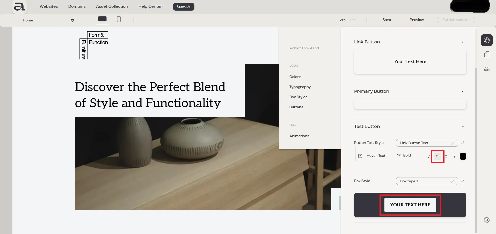
3.4.3 - Hover Text “Uppercase”
Section titled “3.4.3 - Hover Text “Uppercase””To transform the hover text to uppercase, click the “Uppercase” button.
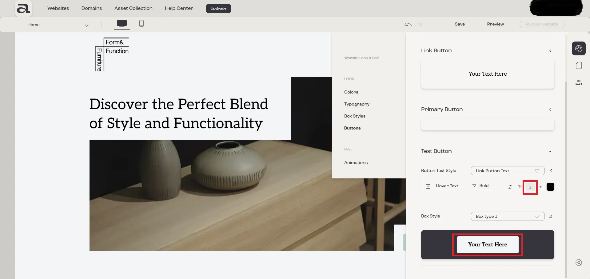
3.4.4 - Hover Text “Underline”
Section titled “3.4.4 - Hover Text “Underline””To underline the hover text, click the “Underline” button.
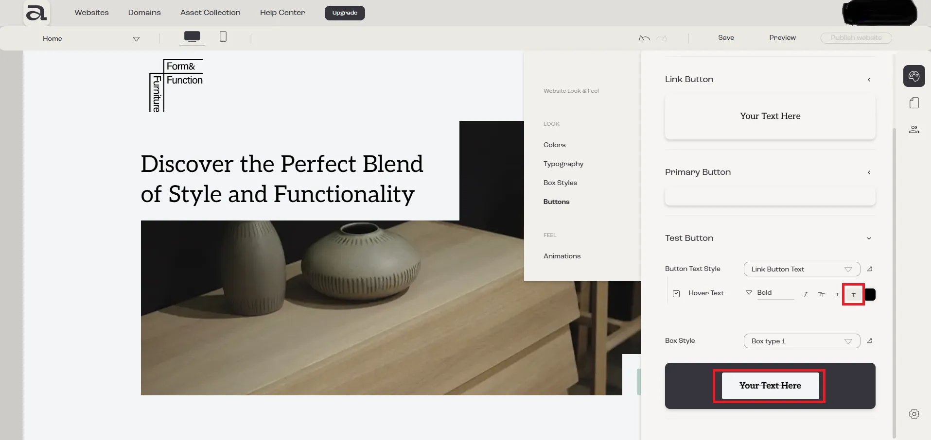
3.4.5 - Hover Text “Strikethrough”
Section titled “3.4.5 - Hover Text “Strikethrough””To apply a strikethrough effect to the hover text, click the “Strikethrough” button.
3.4.6 - Hover Text “Color”
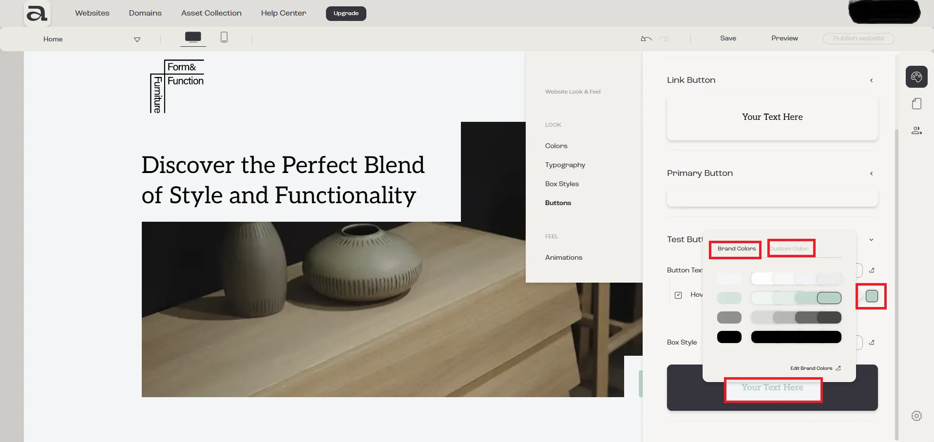
Section titled “3.4.6 - Hover Text “Color””To select a color for the hover text, click on the “Color” icon.
You have two options for selecting a color:
- Brand Colors – Choose from the predefined brand colors you previously added.
- Custom Colors – Select a custom color.